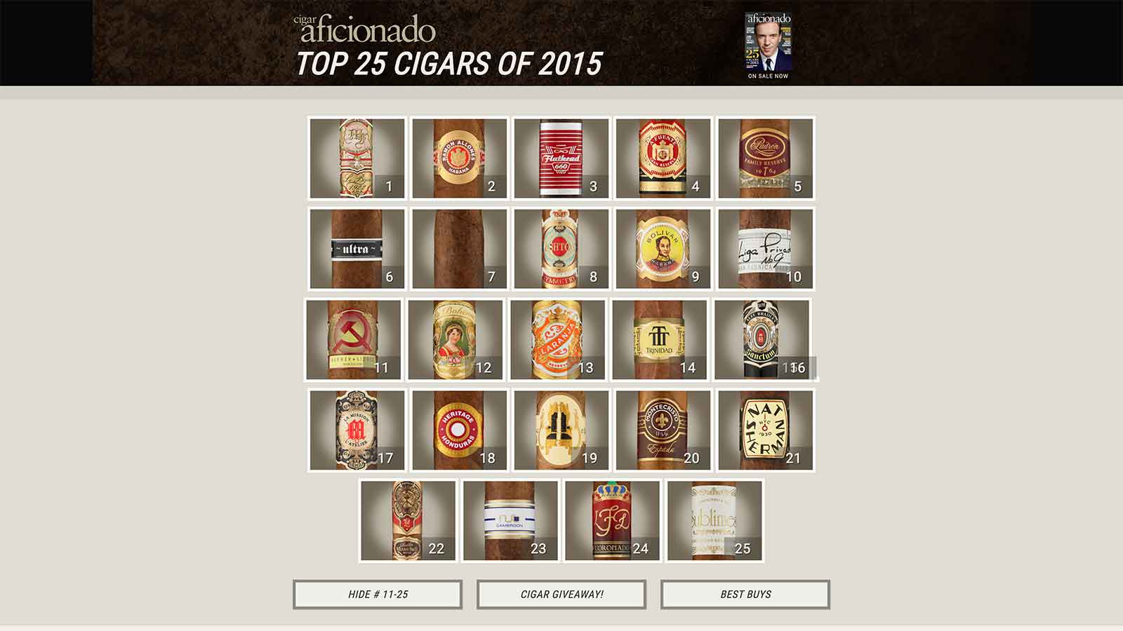
Summary: The microsite of the Top 25 Best Cigars of the year, the most popular section of Cigar Aficionado magazine’s website, was in desperate need of a redesign.
An inconsistent, poor user experience overall, the microsite also lacked space for sponsor advertisements, didn’t match the visual standards of the brand, and didn’t do a great job of displaying the Top 25 archives.
Company: Cigar Aficionado
Project Date: 2014
Activities: Content Audit, Content Model, CMS Migration, Copywriting, UX Writing, Marketing, Omnichannel Strategy
Partnering with design, marketing and engineering, we overhauled look of the site, built in space for ads, and migrated the site and archives over to WordPress. The outcome was increased ad revenue, record-breaking metrics, and a user experience that was shared and celebrated over social media channels.
Problem: The magazine’s annual Top 25 Best Cigars of the Year list had grown to become the most popular channel on the website. As more information was added, however, the landing page became cluttered with too much text.
Solution: The Top 25 landing page needed to be redesigned to align with the aesthetic of the rest of the website. The information on the page was good, but it needed to be reshuffled.
Process: To help out the visual design team, I performed a content audit on the Top 25 landing page. The most glaring problem was that the page contained far too much text, which took the focus away from the actual cigar list.
The first elements user’s saw were two long paragraphs explaining the magazine’s tasting and ranking methodology. It’s good information, but I figured it would serve users better if it was treated as additional background instead of the star of the show. So I recommended moving the methodology paragraphs down the page.
The old design also included an awkward link to see the full Top 25 list. I suggested to delete that link and instead simply show a thumbnail for each cigar on the list. This bumped up the visual elements while also eliminating a needless click.
Data from past years showed that the Best Bargain Cigars section had become nearly as popular as the Top 25 list itself. To capitalize on this, I added a more visual call-to-action button and changed the name of the list to Best Buys, a phrase that resonated better with readers. In turn, the visual design team redesigned the list, too, to boost readability.
Lastly, the top 10 cigars on the list each included a short video of the editors smoking and talking about the cigar. These videos appeared at the bottom of the cigar detail pages, but also as links on the landing page. This created a detached feeling for users, so I removed the links from the landing page and shifted the videos on the cigar detail pages to the top to be more prominent.
Results: The new landing and cigar details pages helped the next Top 25 list not only meet key performance indicator goals, but exceed them. Pageviews improved and social shares went up while bounce rate was drastically reduced.
