Summary: The microsite of the Top 25 Best Cigars of the year, the most popular section of Cigar Aficionado magazine’s website, was in desperate need of a redesign.
An inconsistent, poor user experience overall, the microsite also lacked space for sponsor advertisements, didn’t match the visual standards of the brand, and didn’t do a great job of displaying the Top 25 archives.
Company: Cigar Aficionado
Project Date: 2010
Activities: Content Inventory, Content Audit, Information Architecture, CMS Migration, UX Writing, SEO
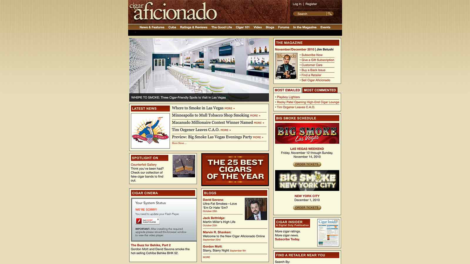
Problem: In 1997, Cigar Aficionado magazine launched its website, the first digital property from the most popular publication to cover the world of cigars. The website served mainly as an extension of the magazine, providing supplemental and archival content, a database of cigar ratings, subscription information as well as some video content.
Thirteen years later, stakeholders believed the website needed a new direction, both in terms of aesthetics and functionality. Additionally, the circulation and advertising departments requested features that just didn’t work on the old framework.
Solution: In order to update CA.com, it was paramount to migrate any legacy content over to a modern CMS. Additionally, the site’s content needed to be organized to help readers find what they wanted and also boost site search rankings.

Process: As the editorial lead on this project, I first conducted a content inventory and audit of the site’s 30,000+ pages. I needed to get an idea of what we were working with and figure out what content was worth keeping and what needed to be deleted or rewritten. The exercise revealed that the site was littered with duplicate content.
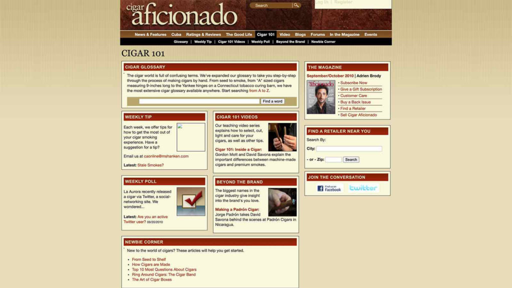
More importantly, site analytics showed that cigar education-based content was extremely popular with our audience. I decided we needed to boost this type of content for the new site. Working with the rest of the editorial team, i.e., our subject matter experts, I put together a plan to organize and add new content to the Cigar 101 channel.
I also removed any content that had become outdated or directionless, and then I improved the site taxonomy by putting what remained into categories with tags. Ultimately, the goal was to encourage users to journey towards our database of more than 13,000+ cigar ratings, which was the major moneymaker for the magazine at the time.
The ratings, though, were behind a paywall, and I recognized an opportunity to adopt an “email for access” type model. Instead of having to pay for access to the ratings, users could instead opt-in to the magazine’s e-newsletters to view the ratings.
The visual design team also added social share buttons to all articles as part of a larger strategy to improve the magazine’s social footprint.
Lastly, as the editorial lead I was charged with writing much of the short copy for the website. Seeing as much of our audience skewed older and was not completely comfortable with technology, I determined copy needed to be quite literal in order to drive traffic successfully.
Outcome: The new site was an instant hit. We actually ended up launching a beta version alongside the old CA.com as a way to slowly introduce our readers to the redesign, plus perform some internal A/B testing.
In the end, pageviews and average time on page improved dramatically, while the company’s email list grew exponentially.